Anatomy of a TPT Cover
**IMPORTANT** - Be sure that whatever you use is for commercial use and you follow the Terms of Use outlined by the artist!!
Once you've selected your size, it's time to build a cover.
Here are some items to consider when creating a cover.
⇒ BACKGROUND
If you are using a background, choose something that isn’t too distracting to take away from your title and product. You can do a color fill, a digital paper, or a stock photo.
⇒ FRAME
I like to use a frame with a white background so the title doesn't blend into the paper/photo.
⇒ TITLE
Your title should be large and bold. Your title should be appropriate to your product and stand out. Remember that many people are doing a quick search for something that might be suited to their students' needs, or they are on a mobile device to do their searching. Check it even after you post the product. There are many times I have to go back and redo the cover because what I thought would work cannot be seen clearly. You can use fun fonts just be sure they are readable. TPT has many fabulous font artists. Be sure you purchase a commercial use font for your products.
⇒ PRODUCT
You might want to add a photo of the product in use. You can also shrink a few pages down and use those on the cover. These images should be the focus - not clipart you are adding for decoration.
⇒ CLIPART
If you are using clipart, be sure it is age-appropriate. Think about your audience and what they might be attracted to NOT what you are attracted to. TPT has many fabulous clip artists for a variety of levels. Do not make this stand out more than your product (for non clipart products).
⇒ BRANDING
Add your logo and/or your name to the cover.
Other Things You Can Add
⇒ GRADE LEVEL
Some sellers add this and some don't. I started adding it to my products about a year ago. This gives the buyer an idea of the level while they are scrolling through search.
⇒ COMMON CORE OR OTHER STATE STANDARDS IDENTIFIER
If you are going to add this information, be sure it meets the standards you are identifying.
Final Thoughts
Add the items that are going to make an attractive cover for your products. Everyone is different, and everyone's covers should look different. I suggest looking at a variety of covers for some ideas. Check different sellers in your area of expertise. Do a search for a topic you offer and see what the covers look like. Can you spot yours? I do not suggest you copy someone else's idea to make your covers exactly like someone else. You want your products to stand out in the sea of TPT products.
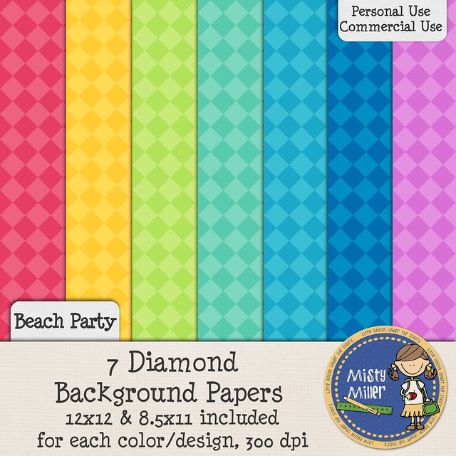
I do have a free set of background papers that can be used on covers. Feel free to download by clicking
or on the image below. The papers are for personal and commercial use, and a Terms of Use (TOU) is included.

Don't forget to join the newsletter email. They will have more tips and motivation for you.