Thumbnails and Previews
You've created your resource and you are uploading it to TPT. You see some extra spaces that say Preview and Thumbnails. You are now wondering if you should put anything there or just ignore those boxes. I have some popular questions to answer today dealing with thumbnails and previews. So let's just jump right in!
Thumbnails and previews - is there a difference?
Yes!
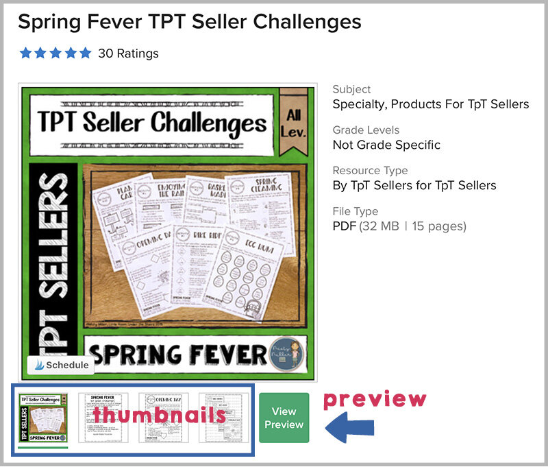
➻ Thumbnails are the little pictures that show up as you scroll across the images under the large square where you see your cover.
➻ Previews are where you click the green View Preview button and a window pops up.
Do I need to use both?
Yes!
➻ Some people will just scroll through your thumbnails. I like to think of these as a snapshot of the product.
➻ Some people will click on the preview. I like to think of the preview as letting the buyer know with images what they will be getting if they purchase your resource.
⚠ Some people will pass up your resource if you do not have a preview.
What should I put in the thumbnail place?
There are 4 thumbnail spaces. Use all of them!
➻ The first one is marked Main Cover. You will want to upload your cover (jpg or png) to this box. I prefer square covers myself. You can read more in this post about covers: Choose a Size.
➻ That leaves you with 3 more boxes. You can include:
◈ pages right from the resource
◈ photos of the resource
◈ your pin for the resource
You will upload them in Edit mode like below.
➻ I generally just use pages right from the resource. This shows the potential buyer what your work looks like.
➻ The space is square if you want to get fancy. I would not suggest doing collages because the space is small.
⚠ I avoid putting answer keys in this space. Students are getting pretty smart about what TPT is.
What should I put in the preview?
Buyers want to see what they are getting. It's important that they get a good sense of the resource through the preview before they spend their money. This means showing some close ups of what is on the pages.
➻ For the preview, I like to show most of the resource.
➻ I upload this as a PDF.
⚠ I avoid putting answer keys in the preview.
➻ You can also pages that have a few sheets and add some text like "teacher directions", "answer keys are provided", "has 3 levels for differentiation", "includes a printable version and a digital version", etc.
➻ You can do collages here, but I try to avoid putting too many pages on one image.
➻ I do set the PDF to not allow printing. This is done when you password protect it.
➻ I put a preview watermark on each usable page.
Upload your PDF preview in the first box. If you have a Video Preview it goes in the second box. (In Edit mode)
Do I need a Video Preview?
A Video Preview is an option and it is totally up to you if you also include one. If your resource is better explained through a video, then you should add that. Keep it under about 2 minutes.
⚠ This should not replace the regular preview.
So head to your store and see if you have thumbnails and a preview for each resource. If not, add it to your To Do List to add them.
Interested in learning more on how to make thumbnails, previews, covers, and more. Check out my Next Step Seller Course.
Keep growing your store one step at a time!


